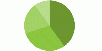
A pie chart is a divided circle, in which each slice of the pie represents a part of the whole.
The categories that each slice represents are mutually exclusive and exhaustive. Data with negative values cannot be displayed as a pie chart.
Pie charts can provide a quick overall impression of a data set, but do not offer very detailed information. Additional information can be added into pie charts by inserting figures (e.g. percentages) into each segment of the chart, or by providing a separate table as a reference tool. However, some of the advantages of visualising data are lost when figures or a separate table are required to understand the data.
It can be difficult to judge comparisons between slices of the pie, particularly when there are many slices or the slices are thin slivers. Limiting a pie chart to four slices results in a more interpretable visualisation. Many in the data visualisation field believe pie charts are always inappropriate because of their interpretation difficulties. Despite that, they remain a popular type of data visualisation.
Examples
Example in which click-through rates are compared using a pie chart:

Source: Elizabeth Zelesny
In this example, the proportion of homeowners and renters for each area are represented through pie graphs:

This example represents the age of program participants as proportions of a whole:

Advice for choosing this method
Deciding whether to use a pie chart depends on the properties of the data. Pie charts are effective for comparing a given category (a slice of the pie) with the total (the whole pie), particularly when the category is close to 25 or 50 percent.
The area of the slices of pie charts better represent relative size. However, the length of bars in bar charts offer a better option to show subtle differences between categories than pie charts. Bar charts represent data size more accurately and allow for easier comparisons between data sets.
Pie charts should not be used to show increases and decreases, numbers in each category, or direct relationships between categories in which one set of numbers depends on another. In the last case, a line graph would be a better format to use.
Another limitation of pie charts is that they do not show changes over time, unless displayed as a series of small multiples. Even then, comparing across multiple pie charts is difficult unless they have very few slices, like the example shown above.
Advice for using this method
The complications described above, especially related to human ability to judge and compare areas, are exacerbated when pie charts are rendered in three dimensions. Pie charts should be displayed in two dimensions.
When creating a pie chart, sort the slices from greatest to least, with the left side of the greatest slice beginning at the top, at 0 degrees.
Resources
Sources
Pie chart. In (2012). Wikipedia. Retrieved from https://en.wikipedia.org/wiki/Pie_chart
The Open University. (2012). 6 pie charts. Retrieved from http://www.open.edu/openlearn/education/mathematics-education/more-working-charts-graphs-and-tables/content-section-0 (no longer active)
'Pie chart' is referenced in:
Framework/Guide
- Rainbow Framework :
Method